 建筑 公共 展廊 展览 GRC 英国 伦敦 Prize Zaha Hadid Architects Roca
Zaha Hadid Architects, acclaimed winners of this year’s Stirling Prize, have designed the new
Roca London Gallery located in the well-known Chelsea Harbour district near King’s Road. Roca
is a leading global bathroom brand which, through its renowned Innovation Lab, is dedicated to
developing cutting edge, technologically advanced products that continue to set the benchmark
for the industry as well as to underline its position as market leader.
Zaha Hadid Architects (ZHA) were chosen by Roca in 2009 to create a versatile reference space
capturing the essence of the brand and its values. It is also the latest in the series of Roca
Galleries globally, which include the Roca Barcelona Gallery, the Roca Madrid Gallery and the
Roca Lisbon Gallery. In all cases the Galleries have been designed in conjunction with
architectural studios of international repute and are universally characterised by their design,
quality and innovation as well as the imaginative use of materials and the most advanced
interactive technologies.
The Roca London Gallery expresses Roca’s commitment to innovative design, sustainability and
wellbeing through an architecture that offers visitors a unique experience which is both visually
and interactively engaging. Taking its inspirational cue from the idea of a space created by water
in its various different states, ZHA’s bespoke design defines a flowing and porous space for the
1100m2 Roca London Gallery.
The dynamic language is characteristic of the practice’s many projects globally, yet specific to the
functional needs of Roca as a brand, and evolved in a bespoke manner for its purpose. With
utmost precision and functionality, it integrates the latest communications technology the Gallery
is equipped with in an aesthetically responsive and seamless manner.
Zaha Hadid Architects have created a precisely ordered, intimate and enjoyable sensory design
environment which stimulates the visitor through its active and engaged relationship with Roca’s
exceptional bathroom products. The concept defining each of the Roca Galleries is to take the
visitor far beyond simply researching and choosing products in order to create a uniquely
enjoyable sensory experience, enabling visitors to enjoy all the qualities of the brand. Instead of
a conventional showroom, the Gallery is an immersive reference space of ‘edutainment’ for the
wider community capturing the essence of the brand.
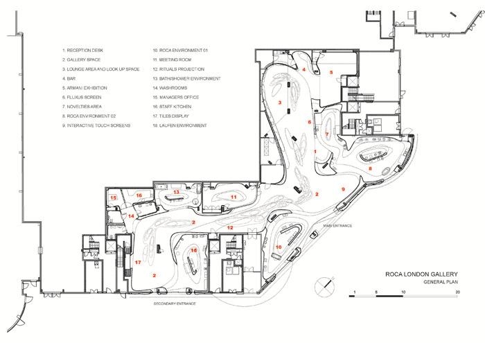
The Roca London Gallery is a single space of 1100m2 including connected, semi-open zones for
product displays and a meeting room space seamlessly incorporating a range of state-of-the-art
interactive technologies and audio visual resources. Designed as a versatile multi-purpose
environment, the Gallery will host a wide range of social and cultural events of interest to Roca,
including exhibitions produced in-house and externally, meetings, presentations, debates and
receptions. Zaha Hadid Architects has fully addressed this need for a place defining harmony
between form and function in which visitors experience the very essence of Roca.
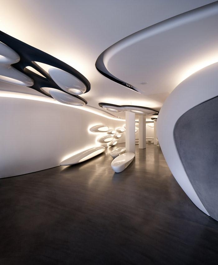
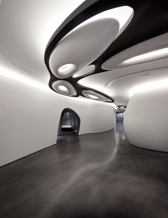
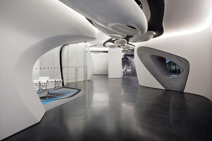
The design brings about a connective language between the architecture and the bathroom
products, with the movement of water ‘carving out’ the interior and moving through the Gallery as
individual drops. A flowing, all-white space made of faceted GRG (gypsum) panels serves as a
central axis of the Gallery. Around this a number of smaller connected semi-enclosed spaces can
be viewed through openings in walls. As a result, the visitor never feels enclosed in one space,
but can always see beyond it into the space through overlapping and cutaway forms that enable
a pleasing permeability to the Gallery.
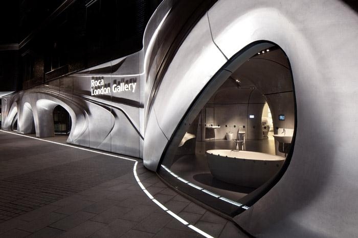
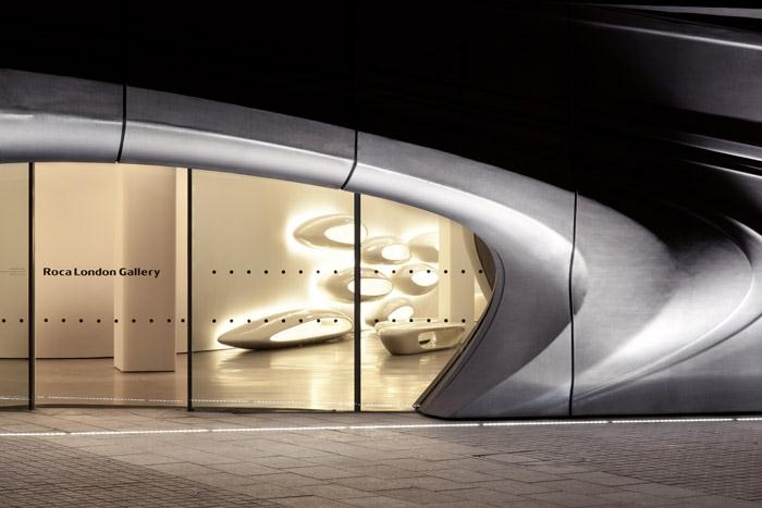
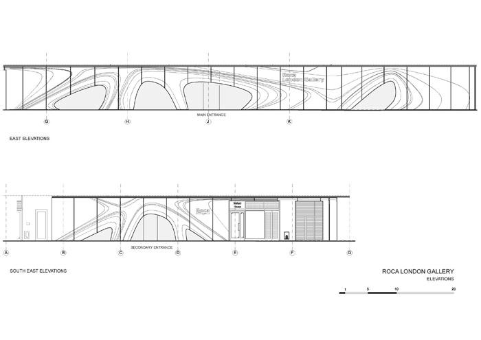
The design theme of water movement extends to the dynamic fa?ade of the Roca London
Gallery, which appears initially to the visitor approaching the architecture like a set of ripples in
movement across the exterior of the ground level space. The grey fa?ade has large apertures for
the main entrance and windows and an appearance of tactility, creating a sense of intrigue on
the street as the visitor approaches.
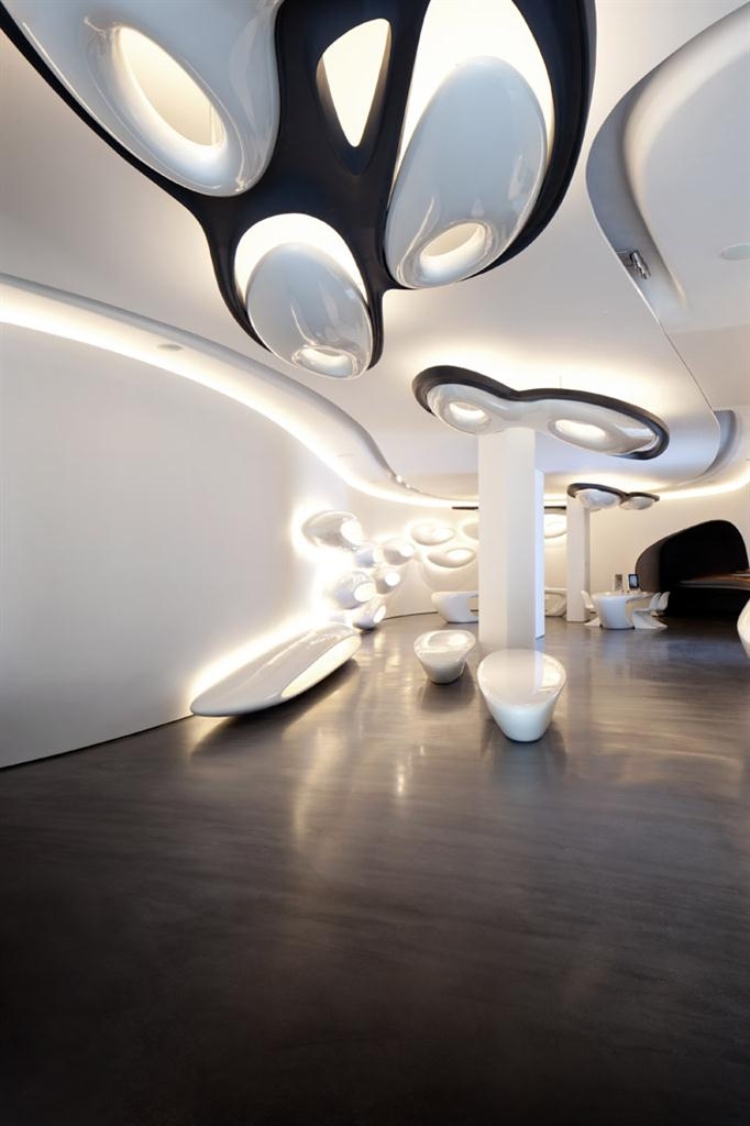
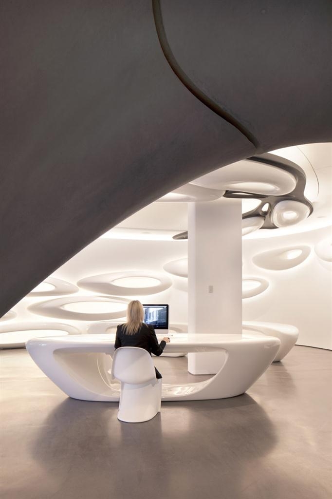
Water defines the landscape of the interior space, creating a sense of mobile liquidity reinforced
by a series of elongated, illuminated water drops. These cascade around the ceiling as a set of
lighting fixtures, down the walls as shelves for books, media and small products, and onto the
floor as tables and seating. Their fluid lines of convergence both lend each area of the space an
individual identity and connect them by the way they define a feeling of movement.
All the panels, which are made of GRC, or fibre reinforced concrete and extend up to 2.20 metres
in height, have been pre-fabricated in moulds and constructed on-site. The fa?ade is made of 2 x
4 metre panels of 800kg each. The panels creating the interior walls are 6cm thick and made of
two waffled concrete layers sandwiching a honeycomb mesh that can stress in different directions
and is very robust as a composite material. The furniture is made from GRP, or reinforced
plastic, including the cove-shaped reception desk. The lighting scheme created by Isometrix is
also innovative in a complementary way, with special features including washing the walls in light
and a mix of direct and dispersed mood lights.
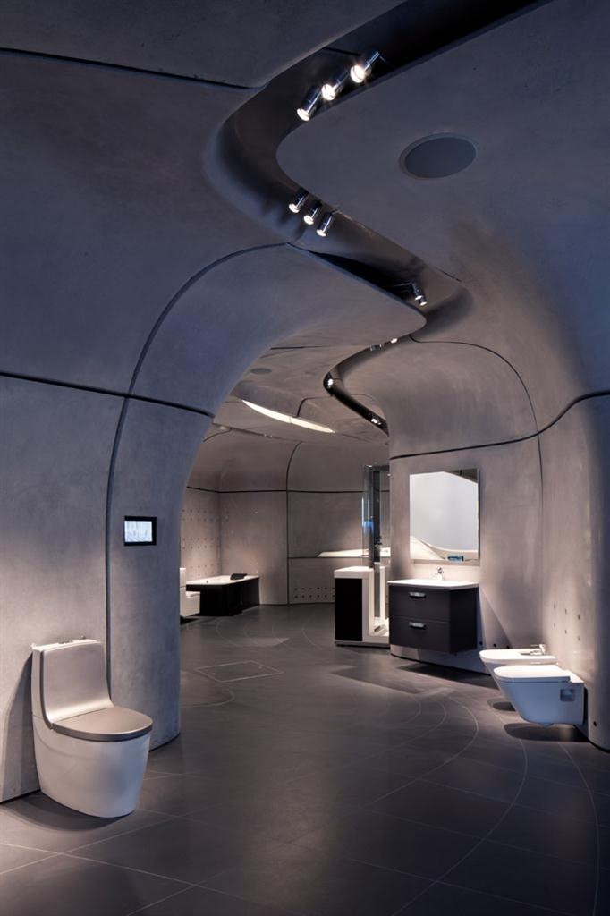
Part of the brief was to include a series of bathroom product ensembles integrated in the space,
and the Gallery’s walls give way in six locations to semi-enclosed, cave-like spaces of GRC
panels for the product displays, as well as to the bar and reception area. The cocoon-like
meeting space has a wall of GRG, a continuation of the Gallery’s central axis. A special feature of
the Gallery is the floor of the product exhibition areas, which has a mosaic of porcelain tiles
designed exclusively for the space by Zaha Hadid Architects. With each one cut and laid
individually, the design creates an optical effect inspired by a water current.
The language of fluidity and natural movement is driven by ZHA’s commitment to parametric
design tools and to the creative possibilities arising from the constant evolution of manufacturing
processes and techniques. Both panels and the moulds used to create them were realised via 3D
modelling, and produced in a sequence so that they would be fully compatible.
The architects’ geometry is akin to natural forms, with no one point in the space being projected
vertically. They enjoy being challenged by this and the innate complexity of the process of
bringing the design to respond fully, through modelling and testing, to very specific social
functions.
New technologies and social media have become the primary communication tool today
and for the visitor to the Roca London Gallery they play a key role. These new media
resources enable visitors to be entertained as well as to learn about the values, history and
special achievements of the brand, including its social responsibility and commitment to the
environment and to water sustainability. Touch-screen interactive technology sited at the
entrance is treated by Zaha Hadid Architects’ design as an integral and complementary element
within the Gallery.
扎哈哈迪德是炙手可热的普利策奖建筑大师,最近她刚刚完成了位于伦敦切尔西海港区英皇道的新
乐家展廊。乐家是一家全球领先的卫浴品牌,通过其著名的创新实验室,致力于开发尖端,先进的
产品,设立行业标杆,处于行业领先地位。
这个展廊是最近乐家展览的一个系列,这些展廊大多由世界著名建筑师设计,独特,先进,具有想
象力。
乐家卫浴产品部高级董事总经理 Miguel Angel Munar 表示:“对乐家而言,在伦敦这样一个全球设
计和创新之都开展业务非常有必要。在乐家伦敦展厅,扎哈-哈迪德用这样一种极令人激动的、触手
可及的方式完美诠释了我们的所有品牌价值观和公司理念。”
扎哈-哈迪德补充说:“我们的工作是赋予建筑复杂性和自然美。乐家伦敦展厅外观上采用了水的运动
形式,如同经过流水的侵蚀和冲刷;建筑与自然界之间这种神奇的相互作用堪称鬼斧神工,雕琢出
了一系列动态空间。”
乐家伦敦展厅由一个单独的大厅组成,面积1100平方米,正如扎哈-哈迪德工作室所愿,它看上去好
像每一个细节都由水雕琢和定义而成。
建筑外观清晰地展示了乐家致力于设计和创新的承诺,其与众不同、别具一格的建筑正面成为乐家
伦敦展厅独有的身份特征。
水的运动是乐家伦敦展厅最重要的主题 -- 外观和室内处处体现了流水和汇流。室内采用白色混泥土
雕刻装饰,最先进的灯光照明也将每个不同的区域连在了一起。
乐家伦敦展厅并不将仅仅是一个展览馆,它还将成为伦敦的一个中心建筑,用于举办各种活动,如
国内外展览、会议、报告、研讨会和辩论会。
水主题体现体现在各个方面,并使空间看上去如同飞船般具有未来感。入口就像是激起的涟漪。大
大的圈形正门和窗户让室内外的区分削弱。内部的空间流动明亮,从灯具,货架,到家具座椅,都
具有动感的线条。2.2米高的GRC面板在现场制造和施工。外表皮的板单元尺寸是2×4米,荷载0.8
吨。家具以及接待处是由增强玻璃钢制成。照明光线分为直接光源和营造氛围的剪接光源。
这里就是一系列位于产品与空间的完美合奏。其中一个展示区的陶瓷地面是由事务所设计的独一无
二,每一块尺寸都不一样,最后形成像水流般效果的地板。
参数化设计工具和发展的技术让这一切得以实现。空间自然,没有垂直投影的地方。建筑师享受这
样的天份性和复杂性设计。
乐家展廊不仅美轮美奂,还兼具功能性和灵活性,并配备了最尖端的、现代化的、视听、音响和照
明设备。它让参观者能与乐家品牌互动交流,并有机会了解该公司的历史及其重大成就和价值观:
对可持续性的承诺,特别是对创新、设计、健康和节约水资源的承诺。